This paper is written to help the reader gain a better understanding of the trade-off between taking on additional risk through higher stock market exposure and the return potential associated with it. The paper looks at the last 29 years of data which includes the last three recessions. This should help the reader have a general understanding of the differences in the risk levels of the portfolios. We will also look at the differences in the long term returns of the portfolios. This paper should be viewed as a general guide using historical returns, and should not be used as an indicia of future performance.
For this illustration, the model portfolios had the following allocations and were rebalanced back to the stated allocation each quarter.
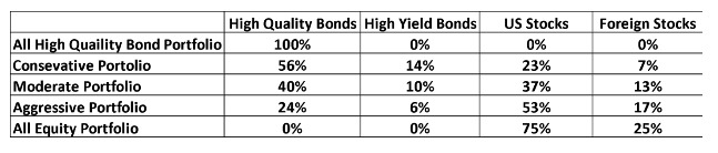
The returns used for this analysis are the broad, most representative indexes associated with each category.
The following table shows the average annual rate of return for 29 years ending December 31, 2015, for each of these five portfolios.
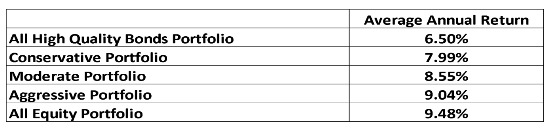
The additional return associated with moving to portfolios with higher stock market exposure is consistent with what one would expect. Capital market theory expects there to be a 3 or 4 percent higher annual return for the stock market as compared to the high quality bond market over a longer-term time period, such as in the example above. The following table shows the additional return associated with moving to portfolios with higher exposure to stocks.
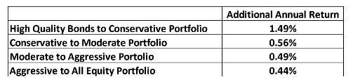
As you can see, the additional return is significant particularly when one has a longer term time horizon. One other point that can be observed is that the greatest additional return comes when stock market exposure to your portfolio.
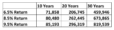
This return difference can make a great impact in the value of one’s account balance over longer periods of time. As an example, the following table shows the difference in what an account balance would be in each of three portfolios. It is assumed that one is putting $5,000 dollars into an account per year, which earned 6.5%, 8.5%, and 9.5% each year, and what the ending balance would look like over a 10, 20, and 30 year time horizon.
Of course additional returns don’t come without additional risk. There are several different ways that risk is measured. The one that many believe is the most relevant is how much decline occurs in market value when we have a significant downturn. These declines are typically associated with recessions in the economy. Over the time period we are examining, there were three recessions. The following table shows the decline in market value that occurred in each recession, for each portfolio that had some stock market exposure.

The basic observation from this table is as you’d expect, the more stock exposure in the portfolio, the larger the decline in market value during recessionary periods. Now, these numbers aren’t pretty, but remember – the annual average returns shown in the second table include all three periods of decline, and yet were still able to produce strong returns over the long-term.
When you are selecting a model portfolio, it is important to consider how much downside volatility, or market value decline, you are both willing, and able to take. If one is likely to get so uncomfortable with a decline that they will not be able to ride through the downside, then they probably have too much stock exposure. Also, if you have to withdraw or spend significant portions of your balance during a downturn and cannot absorb the losses caused by the liquidation, you may have too much stock exposure.
This relationship of higher returns being associated with higher risk is the reason that people who have longer time frames to invest, and are willing to tolerate the occasional declines in the markets have been well rewarded for doing so.
One last note with time frames. The investing time horizon is generally associated with when the money is going to be used, not one’s retirement date. Since people could still have ten, twenty years, and maybe even longer to live after retirement, it is generally believed that even during retirement there is sufficient time frame for some stock market exposure. This means you can take on more risk, but you should review your particular circumstances to determine whether you want to take on the extra risk.
Note:
The High Quality Bond category is represented by the the BofA Merrill Lynch US Investment Grade bond index. The High Yield bond category is represented by the BofA Merrill Lynch High Yield Bond index. The US Stock category is represented by the Russell 3000 Index. The foreign stock position is represented by the MSCI EAFE index, an index comprised of non US developed country stock markets until December 31, 1998. From that point, emerging market stocks were added to the foreign stock exposure and represents slightly less than half of the foreign stock exposure.